4 min read
How a board game gets printed
The box on your screen and the box off the press are not the same object. A primer on dielines, bleed, cutting, folding, colour and card stock.
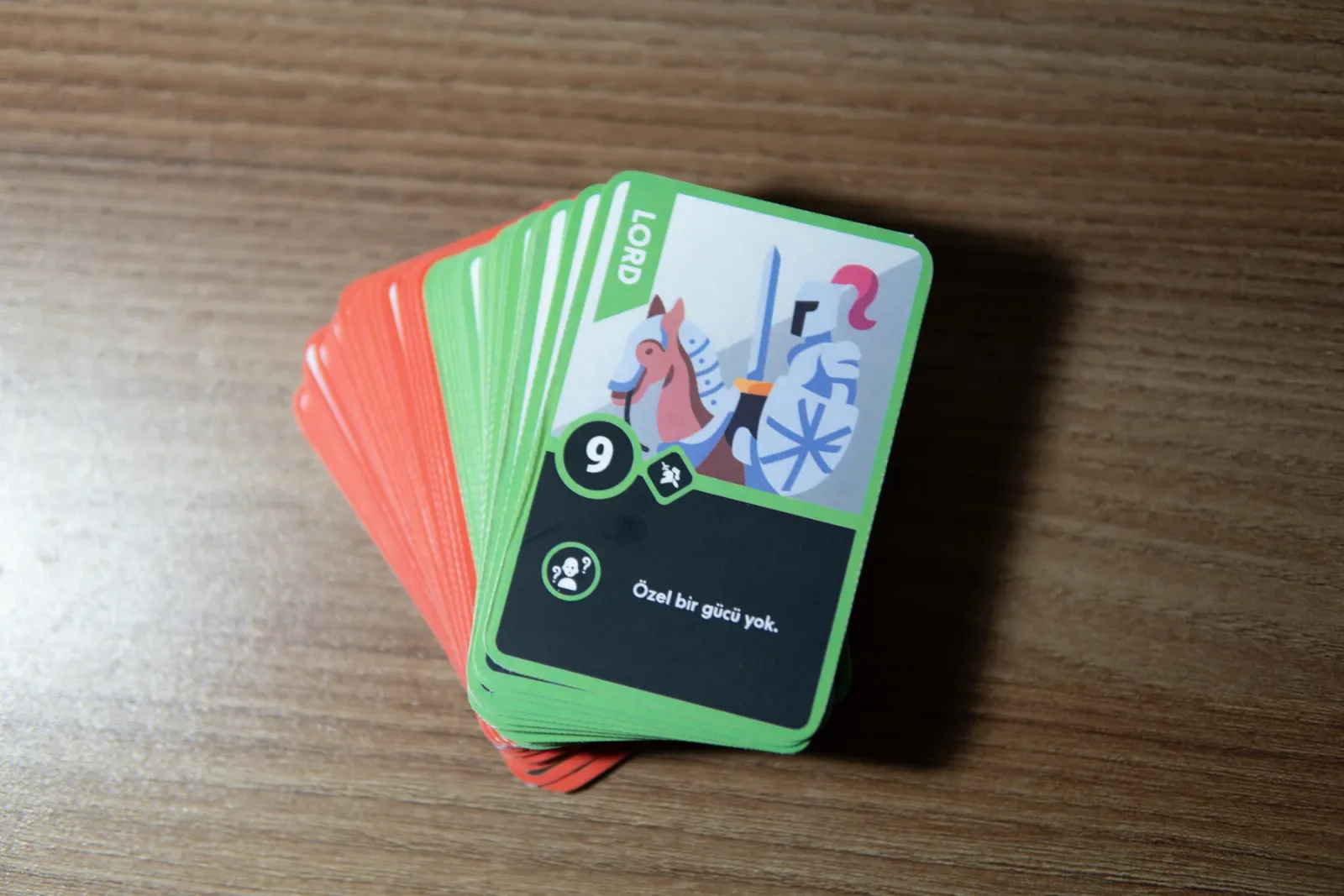
When you design a box on screen, you are really drawing a picture. The file you send to the printer is not a picture, though. It is a set of instructions: where to cut, where to fold, which ink lands where. This is a short introduction to those instructions. As an example I will use the object I know best, the Casus Belli card box: 74.8 × 105.5 × 31 millimetres.
The dieline
Every box starts as a flat sheet of board. The drawing of that flat shape is the dieline. It carries two kinds of line. The cut line shows where the blade goes; the fold line shows where the board will be pressed and bent. The dashed outlines and dot-dash rules around this site come from that language.
On a card box like Casus Belli, the front and back are two panels of 74.8 × 105.5 mm. The sides are 31 mm wide. On the dieline these four panels sit side by side with a glue flap at one end, and the lid and dust flaps sit above and below. Before you allow for board thickness, those four panels alone come to 211.6 mm. The half-circle notch at the top of the front is there so you can pull the cards out with your thumb, and that too is a cut line on the dieline.
Bleed and the safe area
The blade never lands exactly on the line. So every colour and image that runs up to the cut line is extended past it. That extension is the bleed, commonly 3 mm. Without it, a slight shift of the blade leaves a thin white sliver along the edge.
The same logic works inwards. Text, logos and important details belong a few millimetres inside the cut line, in the safe area. Type set too close to the edge can get trimmed, or end up sitting on a fold.
Cutting and folding
Cutting is done with a steel blade bent into the shape of the dieline. The same die holds blunted rules for the fold lines, which crease the board rather than cut it. When a dark, solid colour runs over a fold, the ink can crack along the bend and show the colour of the board underneath. That is why you need to know where the folds fall from the first day of the design.
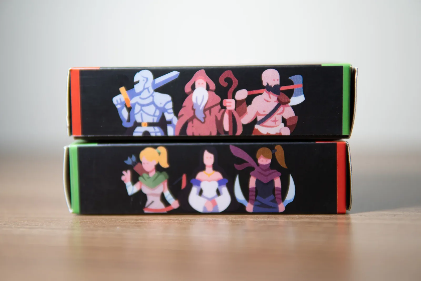
The sides of a card box are the same sheet as the front, folded round. An image that wraps from the front onto the side breaks in the wrong place if the fold drifts a little. Designing the side as a face of its own, with its own edges, lowers that risk.
Colour
A screen works with light, a press with ink. Screen colours are mixed from red, green and blue (RGB); print uses cyan, magenta, yellow and black ink (CMYK). Some colours that glow on screen, especially vivid greens and blues, cannot be reached with ink. Setting the file up in CMYK from the start, and seeing a printed proof if you can, is how you get the disappointment over with early.
Black is not a single colour either. A large area printed with black ink alone can look slightly grey, so large black areas usually get a share of the other inks as well. Small type, on the other hand, is safer in black alone, because it does not depend on four inks landing exactly on top of each other.
Card stock
With cards, the paper is how the game feels in your hand. Weight and thickness decide how stiff a card stands; the surface decides how cards slide over each other when you shuffle. Then there is opacity: hold the back of a card up to the light and you should not see the face. In a game where a face-down card can be read through its back, nobody can bluff.
Before I go to the printer I ask myself four things:
- Does the dieline match the printer’s blade?
- Is there bleed on every edge?
- Is all the type inside the safe area?
- Is the file in CMYK, with the blacks set up properly?
None of this is the exciting part of design. But it is exactly where the box stops being a picture and becomes an object you hold. A hundred hours of looking at a screen will not tell you what one printed proof in your hand does.